

Color drenching is an interior design technique where everything in a room is painted the same color including the walls, ceiling, trim, woodwork, and radiators. By coloring a room in one dominant hue, color drenching can manipulate the size and perception of the space. For example, covering walls with dark colors can make rooms appear smaller by absorbing light blending together interior lines, such as wall lines, with other surfaces. Lighter shades do the opposite and can bring attention to objects and make the room appear larger as the attention is brought to the objects in the room and not the walls of the space.
Color drenching is popular because it is an easy and inexpensive way to transform individual rooms with only one shade of paint. This technique works best with bolder colors that stand out on their own like emerald greens and navy blues as they can hold their own and become the centerpiece of the design. If the goal is to have the furniture pop, darker cool colors like greens and blues allow orange, yellow, and red furniture to stand out while keeping the room feeling more cozy.
This design trend took off in the 1920s when Art Deco became popular as the monochromatic designs allowed for the geometry of the furniture and accent pieces to take center stage. Molding and other decorative accents were able to blend into the wall space while enhancing the goal of creating glamour. And it still exists today, but in different forms including double drenching.
Double Drenching Interior Design Techniques
Double drenching is the same as color drenching except you use two colors instead of one to create balance in rooms that may feel too overwhelming from a single drench. The second color can help highlight architectural features while a single color can cause them to blend in.
Double drenching relies on complementary colors like sapphire blue with emerald green, sage and mustard yellow, or Venetian red with Prussian blue. To double drench you’ll use the first hue on the walls, then complement it using the second color on molding, shelves, even furniture like the fabric of the couches and chairs.
One important thing is to not let the room get too monotonous. Use other hues from the same color family throughout the room via small accent pieces, and possibly lamps on side tables or accent pieces.
Double drenching works well within the 60/30/10 rule of interior design, where 60% of the space will be painted in the dominant hue (walls and ceiling), 30% in the secondary hue (trim and upholstery), and the remaining 10% in a complementary color (decor, plants, small furniture).
How to Apply Color Drenching to Rooms
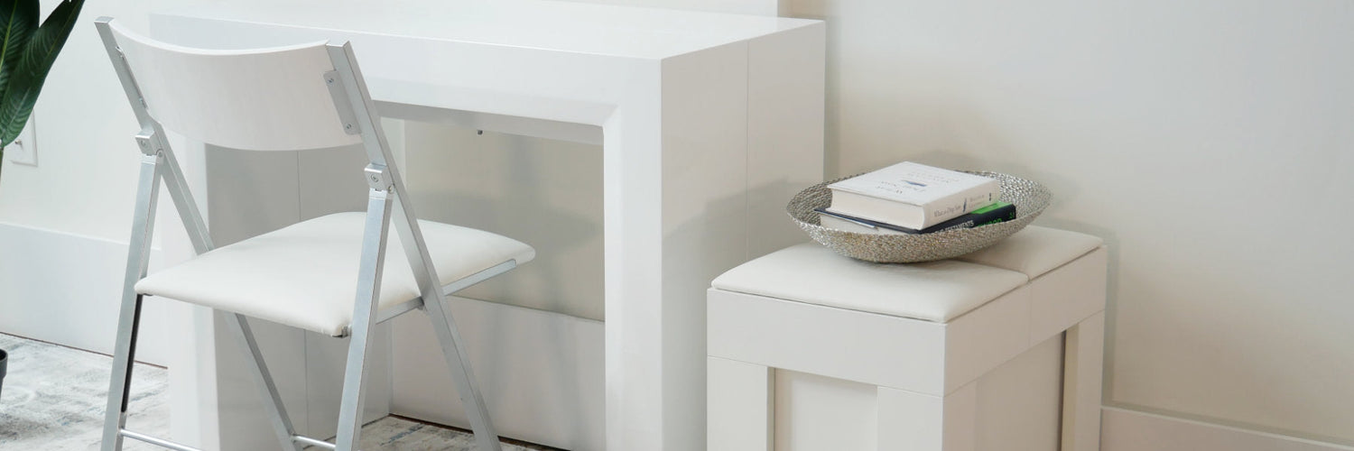
Color drenching is fairly easy to implement and only requires painting interior surfaces (walls, trim, and ceilings) and using matching upholstery to achieve your desired effect. Since color drenching can manipulate the size of a room, you’ll want to be intentful with the color and tone you choose.
Remember, dark colors make rooms feel smaller so they’re better used in large spaces so sitting areas and furniture can stand out. Smaller spaces should use lighter colors to help expand the space making it feel less compact.
And color drenching works incredibly well with molding used on the walls in wainscotting, picture frame wall molding, and a picture rail trim.
Bedrooms
For bedrooms with lots of natural light, darker blue colors like dusty blues, can help create an insulating effect that supports sleep. However, just about any dark shade will work well with enough natural light and can be applied across all surfaces from walls to ceiling and trim, for an immersive effect.
For darker and even lighter shaded drenches help to balance out rooms with neutral colors, such as beiges, whites, and grays in your upholstery, furniture, and linens. Natural wood end tables and chests also help bring balance to spaces, especially when dealing with darker shades. And if you use a rich brown color, you’ll be adding a bit of biophilic design which may help promote relaxation and calmness which is important for bedrooms.
Bathrooms
Bathrooms can benefit from color drenching with light colors since they tend to be smaller and lighter tones help expand the space. When combined with mirrors and other reflective surfaces, the light helps bathrooms to feel less cramped.
Not all bathroom surfaces can be painted, so use the materials available including the color of the bathtub if you have one, shower curtains, tiles, and the window blinds. Sinks, counters, the toilet, and other items in the bathroom itself can be the double drench color, and bath mats can be a third shade to help balance out the 60, 30, 10 rule.
Dining Rooms
Dark or rich shades like maroons and navy blues can make rooms feel cozy and warm while allowing chandeliers, modern dining table sets with white or stone finishes to take center stage, and the place settings can either complement or contrast the color drenched walls to ground the seating area or make it blend for a cohesive space.
If you have a smaller dining room you want to appear bigger, go with a lighter color drench to help reflect more light into the space. If your dining set is darker, it’ll contrast from the walls helping to ground the space and become a focal point. Instead of low hanging lights, use clear orbs or recessed lighting to allow the color drench to complement and expand the space rather than center and close it in.
Color drenching is one of the easiest and most affordable ways to make a space feel larger or smaller, and help your furniture and decor items take center stage. Unlike patterned wall paper and rooms that use a couple of hues for walls that become visual queues for your eyes, color drenches make the features inside the room your visual queues so people enjoy the elements of the space rather than tracing the borders of the room.