
The 60-30-10 rule is an interior design concept that uses objects and colors in a space to create a balanced feeling throughout a room making it comfortable, a focal point that brings focus to an object, or creates a grounded area in a large open space. This rule is applied by sorting the objects in the room based on categories, primarily colors, so 60% of the objects are one color, 30% are a complementary color, and the last 10% is considered an accent color.
The 60, 30, 10 design rule does not mean you need 10 objects; it is meant to help you decide how to simplify your design by creating three categories that take up different amounts of space.
If things feel off balance when you look around a room or you’re about to redesign, this rule can help you arrange, decorate, and style the room so it feels complete by having the right objects in the correct spaces, or by balancing the color palette throughout.
Colors in a Room
The 60, 30, 10 rule can be applied by using colors on the walls with the furniture and decor items, or the wall colors with curtains, and the carpet, and even by using odd shaped rooms with nooks and curves. The first way is balancing the colors with the objects using all three.
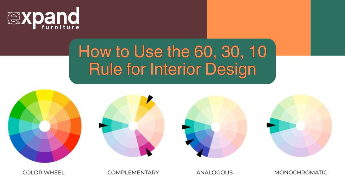
60% will represent most of the walls in a space, 30% applies to the furniture and possibly an accent wall, and the final 10% are the tiny decorative pieces like vases and artwork that brings interest to the room. The three colors can be complementary (across from each other on the color wheel), analogous (next to each other on the color wheel), or even monochrome (different shades of the same color).

One example of a monochromatic spread is light seafoam blue for the walls with a darker blue accent wall that matches the wood-grained furniture’s blue upholstery. As an accent, some lamps with light blue shades on the end tables beside the couch complete a 60-30-10 rule spread.
This works even in oddly shaped rooms, as you can look at the room as a whole, regardless of the shape and proportion of the colors. Using wallpaper, adding curtains, or choosing furniture in similar shades can help you stick to your preferred colors.
Pro-tip: Add an extra 10% in color (called an accent color), to balance out an oddly shaped room. A room with rounded walls may be difficult to furnish, so giving yourself an extra 10% with a stool or chair in an additional complementary color creates the balance.
Using the floor, ceiling, and walls
For this strategy the walls remain 60%, the ceiling 30%, and your floor 10%. Although the ceiling and floor take up the same amount of space, the floor will end up covered in furniture once you fill the room so it can take on an accent or complimentary role when you're designing.
If you choose a neutral wall color like blue-grey or sage green, pair it with dark grey carpet or patterned tile without clashing because the flooring accents the rest of the room. When applying the 60-30-10 design rule to a room with furniture, organize the furniture into types by function or shape.
When sorting by shape, sort into vertical objects like bookshelves, horizontal or rectangular-shaped furniture including chairs and couches, and decorative items like lamps. If the room is a library or reading space, prioritize shelving and storage as the 60%, comfortable seating as 30%, and the last 10% to complete the room would be lighting. This also creates a space of 60% vertical objects, 30% horizontal, and the last 10% decorative alternative shapes.
Décor Items
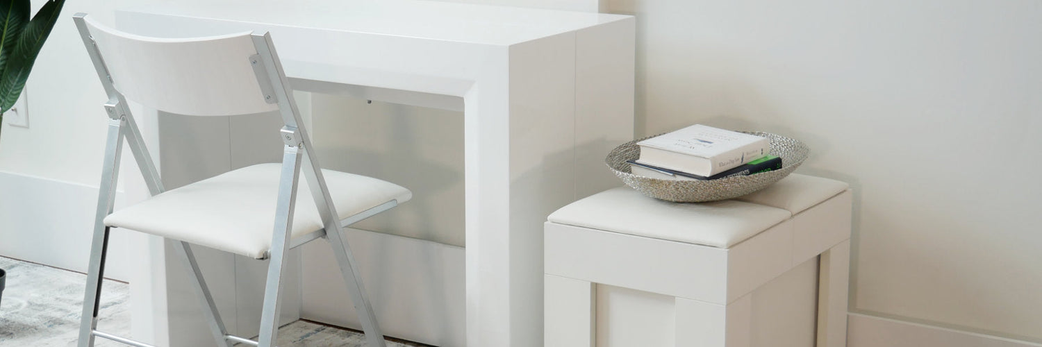
This rule can be applied to the décor items you place on your coffee table by sorting them by type, considering the object’s shape, the amount of space they take up on the table proportionally, or the number of each object.
60% could be 3-4 books or magazines spread across the table, 30% is a combination of a wooden tray and some matching coasters, and the last 10% is a small glass bowl for knickknacks or sweets on the table.
Most of the space is occupied by books, then the tray and coasters. The glass bowl, which has a different color and texture, accents the rest of the table and creates a focal point that brings the eye to the table due to its reflective properties.
Pro-tip: The 60, 30, 10 rule can be applied with the color of the objects on the table. The books could have blue covers, the coasters are wooden and count as a different color, and the glass a third.
Create a Focal Point in a Large Space
If you want to create a focal point in a large space, first identify what you would like to highlight like a piece of artwork or areas to sit to relax. This becomes your color reference for what you want to emphasize or the 10% and can be a couch or piece of furniture for grounding an area in a large space.
Next, look for the color already predominant in that space which could be the walls that make up 60% of the space. For the last 30%, choose a complementary color to the walls, or that is analogous to your focal point.
The color should be on the opposite side of the color wheel compared to the walls or next to the focal color. If the walls are blue, and your accent is yellow, choose a warm orange as your 30%.
For the final touches, choose items the same color as your 10%. In this case you’ll use yellow and concentrate the objects in the area you want to highlight rather than have them spread throughout the room. When done correctly your eye is drawn to the bright color and tries to create a pattern based on the 10% that are grouped closely together.
The 60, 30, 10 interior design rule is one of the fastest, easiest, and funnest ways to create balance in a room or ground a space in a large or expansive floorplan. If you found this guide helpful, subscribe below for more content just like it.