


The colors used in a bedroom impact more than aesthetics, some can be calming which helps you to relax, and others can allow for focus and sleep. This is why choosing the right color palette whether it is a kid’s bedroom that is playful yet soothing, a teenager who uses it for studying, or grown ups that need a relaxing space after work is important.
For example, the colors blue and pink have been proven to lower stress levels, which is why they’re popular choices for gendered nurseries and soothing bedrooms. Babies who are not in tune with their surroundings and parents that are not getting enough sleep both benefit from the soothing hues. This is part of color psychology and how we’re influenced by the colors, tones, and hues around us.
Fun fact: Pharmacists use modern color psychology to differentiate the function of different medicines with white-colored pills being used for soothing pain relief and red-colored for stimulants.
Choosing the right palette for a bedroom requires understanding what colors naturally flow together and what effects they create when synthesized.
Here are a few examples of calming color families and how they work:
- Blue (Sleep): Painting bedroom walls with blue colors can promote relaxation and also make the room darker, making it easier for you to fall asleep.
- Green (Physical Relaxation): Green decor, such as paint, has been shown to promote physical relaxation and mental clarity.
- Pink (Stress Reduction): Though lower than blues, exposure to pink therapy has been associated with reduced stress levels.
- Brown (Resilience and Feng Shui): Although brown can create feelings of anxiety if used in high quantities, sparingly using brown in interior design is linked to feelings of resilience and being warm and cozy. Not to mention brown is a key color in creating feng shui and biophilic (nature inspired) designs.
Every element in a bedroom, from furniture to curtains, sheets, decor, and trim, contributes to the overall color palette, reinforcing or disrupting the mood you want to create. By following the 60/30/10 rule of interior design, you can effortlessly create a color palette using your primary 60% of color on the walls, 30% of secondary colors for furniture and accent walls, and the final 10% of color for accent pieces and upholstery.
Colors should be chosen with intention. For instance, pairing soft sage green walls with warm beige linens creates a serene, spa-like atmosphere that invites relaxation. On the other hand, mixing bold red accents with neon yellow can feel overwhelming and even stressful, making it harder for you to unwind and are not ideal for a bedroom.
When tones work together, the room feels cohesive and calming, but when they compete for attention, the space feels unsettled. Here’s four color palettes that can help you design the perfect bedroom for relaxing, focusing, sleeping, and feeling at ease.
Color Palette to Help You Sleep
Color Palette:
- Navy Blue (dominant)
- Soft Gray (secondary)
- Crisp White (accent)
-
Brushed Gold (pop)
If you go for a darker blue, like navy, balance the space using lighter tones like gray and white to prevent the palette from feeling too heavy. Pops of gold can also be incorporated to add warmth and prevent it from feeling cold.
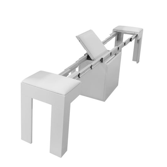
Apply this palette by painting walls or an accent wall in navy, then layering in crisp white bedding and pale gray throws. Furniture upholstered in soft blue fabrics pairs beautifully here for master bedrooms, and glass side tables with wooden legs bring in natural warmth that balances the cooler tones. For kids and teenage rooms, try accent pillows in the soft greys and complementary blue tones.
Gold lamps, photo frames on a dresser, and decor items add subtle pops that elevate the room without disrupting the calming effect.
Color Palette for a Spa-like Bedroom
Color Palette:
- Sage Green (dominant)
- Muted Blue-Green (secondary)
- Light Oak or Walnut (accent)
-
Linen White (pop)
Using biophilic design creates a spa-like feel for a bedroom which can include accent pieces like a fountain, wooden bed frames, and houseplants. The color palette can further bring a nature-inspired feel to the space.
Start by incorporating muted green shades that mimic natural green spaces like sage and emerald greens. These can mesh perfectly with natural wood materials like bamboo, oak, or cherry for a serene environment. Try painting the walls in sage green and use muted blue-greens in upholstery or rugs. Linen curtains or bedding in off-white can be used to soften the palette while keeping the textures appearing natural and organic.
Live plants enhance the restorative effect and tie the color story back to nature. Monstera is always a popular choice due to its tropical looks, ability to grow large leaves, and its signature holes giving it the nickname “Swiss Cheese Plant.”
A Calming Children’s Bedroom
Color Palette:
- Blush Pink (secondary)
- Lavender (secondary)
- Cream (dominant)
-
Rose Gold (pop)
Pastels provide a fun color scheme for children’s bedrooms that can be combined with light accents for a balanced appearance. Paint the walls in cream or taupe as the dominant tone and use upholstered pieces like a blush velvet headboard or lavender throws to bring in the secondary colors.
Then add rose-gold frames, muted brass lamps, or soft pastel pillows as pops of color. This approach creates a balanced, modern room that feels calming without becoming overly feminine or whimsical.
If you prefer a blue theme, change the blush pink for pastel blue or sky blue, and periwinkle or a light blue-grey instead of lavender. The pop here can be an emerald green or black.
Feng Shui Bedroom Color Palette
Color Palette:
- Walnut Brown (accent)
- Beige (dominant)
- Terracotta (secondary)
- Brass (pop)
Keep walls light in beige to maintain an airy feel, then incorporate walnut tones through a modular wooden bed frame, shelving, or extendable tables. Layer terracotta cushions or rugs to add warmth, and finish with brass details like lamps for a subtle shine. The result is a grounded yet cozy environment that makes family members and guests feel safe and at ease.
Color has a powerful impact on mood and perception, which is why crafting a thoughtful theme matters when choosing a color palette for a bedroom. By selecting a palette that encourages focus, calmness, and sleep then applying a dominant shade, layering in supporting tones, and finishing with accents and pops, you can transform a bedroom into a welcoming retreat that feels relaxing and restorative.